UX Project: StockWatch
A Competitor Analysis
Project Scope
A mobile app designed for stock market investors who want to frequently check the performance of various stocks. This should include other various features including gains and losses.
As part of the research for this product, I will look at the various stock market apps already in the marketplace. This will help us understand what other features are necessary to include.
Competitor Feature Analysis
When looking through the features of what is on the market, one could gather useful information about what the user would expect to see when using an app like this. From there, we can build off of the strengths and weaknesses already on market, to create a superior product experience.
The Competitors
When selecting competitors, I looked at apps with similar goals on the Google or App Store that had at least half a million downloads. I narrowed it down to 8 competitors to survey:
- Yahoo Finance
- Uplift
- Market Watch
- Webull
- E-Trade
- StockSpy
- Teletrader
- My Stocks Portfolio
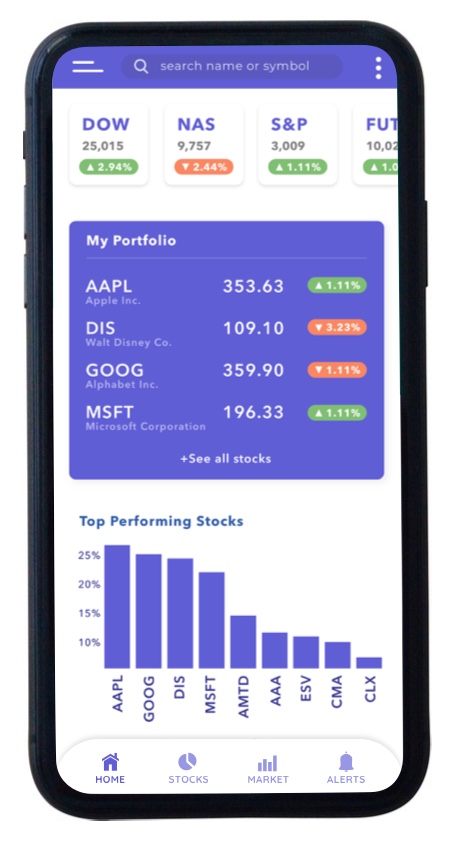
Comparing Home Screens
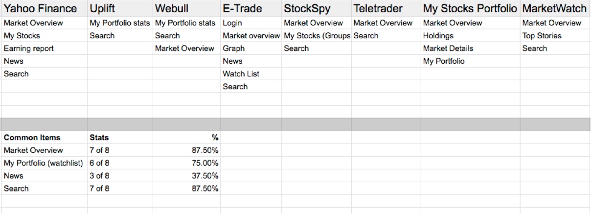
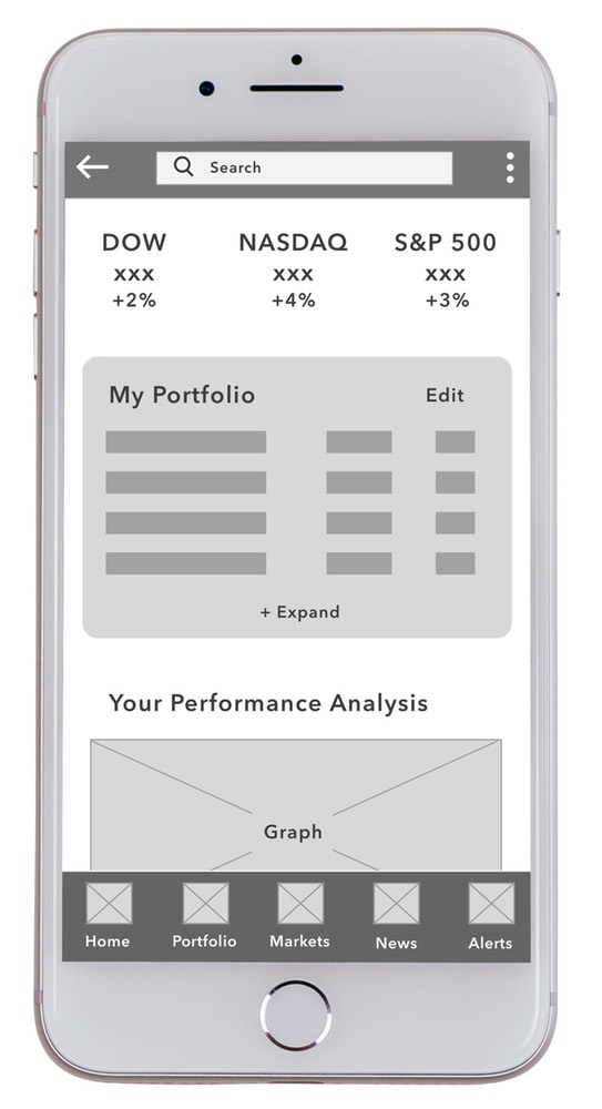
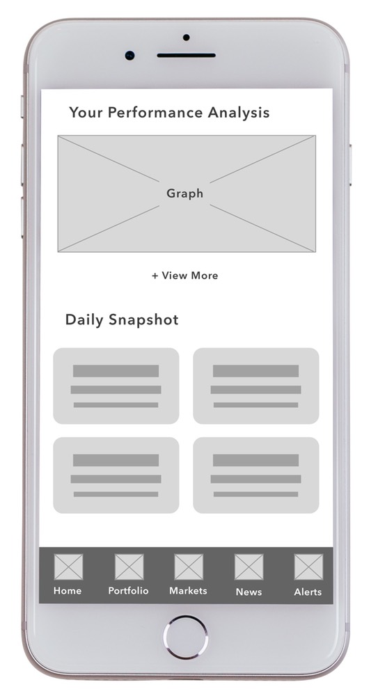
The home screen is the first screen the user sees upon opening the app. This screen is crucial to the user experience, because for an app like this, it can be sometimes used as a dashboard.
A dashboard allows the user to get a quick snapshot of the information they want quickly and efficiently without having to create much effort. Therefore, the most commonly used elements should be placed on this screen.
Most Common Items on the Home Screen - Each app differed on what they included on the home screen, however there were four items that were shown most often. These were:
Market Overview - 87.5% of apps used
My Portfolio (stocks or watchlist) - 75% of apps used
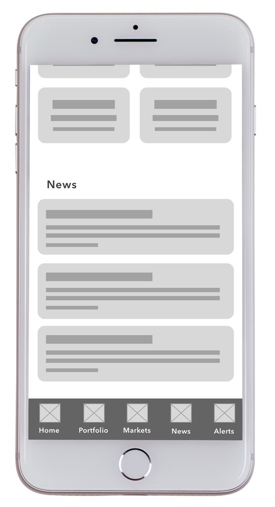
News - 37.5% of apps used
Search - 87.5% of apps used
Navigation
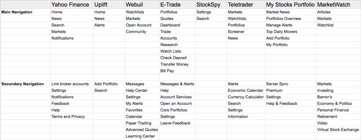
Most apps had a primary and secondary navigation. The primary navigation usually took the form of a sticky navigation bar at the bottom of the screen. The secondary navigation could be in the form of a hamburger menu or a settings rollout.
*Note - The primary navigation sometimes changed depending on the screen the user was on.
Most Common Navigational Elements - When surveying the competitors, there were ten different navigational elements that were used more than once. These were:
Home - 25% of apps used
News & Articles - 63% of apps used
Search - 50% of apps used
Markets - 50% of apps used
Notifications/Alerts - 75% of apps used
Watchlists - 50% of apps used
Settings - 75% of apps used
Portfolio - 50% of apps used
Accounts - 38% of apps used
Help - 50% of apps used
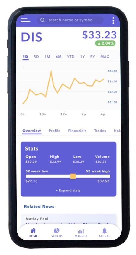
The Stock Screen
All apps had the ability to get a detailed view of an individual stock. This screen is the “heart and soul” of the app, because it allows the user to get a vast amount of data for a particular stock allowing the user to make an educated and informed decision about how to act:
Should I buy?
Should I sell?
Should I hold?
This screen should contain key information as to how the user can arrive at an answer to these questions
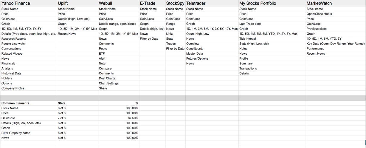
Most Common Stock Screen Elements - This screen was the most interesting survey because there were so many similarities between each app. I found 7 key elements among the apps that were included in almost all of them. These were:
Stock Name - 100% of apps used
Price - 100% of apps used
Gain/Loss - 87.5% of apps used
Graph - 100% of apps used
Filter graph by date - 100% of apps used
News - 100% of apps used
Performance Details - 100% of apps used
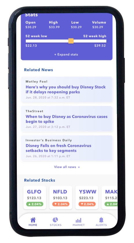
The Stock Details Screen
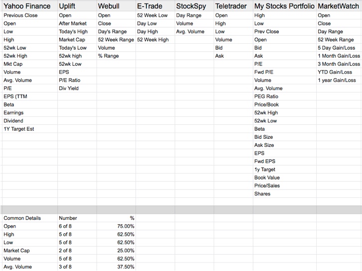
On each app’s stock screen, details about the stock’s performance were included. These were statistics about the performance of that stock during a particular time period selected by the user.
There was quite a bit of discrepancy among apps as to which data was needed by the user. One app only included 3 data points, while another app included 23 data points.
Most Common Stock Detail Screen Elements - With a wide range of details included across the multiple apps surveyed, I was able to find 10 stats that were included most commonly These included:
Open - 75% of apps used
High - 62.5% of apps used
Low - 62.5% of apps used
Market Cap - 25% of apps used
Volume - 62.5% of apps used
Avg. Volume - 37.5% of apps used
Day Range - 37.5% of apps used
52Wk High/Low/Range - 75% of apps used
EPS - 37.5% of apps used
P/E Ratio - 37.5% of apps used
Insights
After compiling the research together from the various apps on market, I was able to begin working on design with a solid framework of what features to include and how to present them, as well as figure out additions I can make to capitalize on market weaknesses.
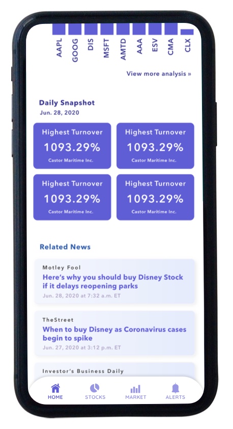
One particular weakness was the lack of tools to do a performance analysis on your portfolio. The real value of these types of apps is to determine if your stocks are performing and whether or not you should make a move to make more money. A tool like this would be a great disruption in the marketplace and is something I would like to include as a snapshot on the home screen.
Product Requirements
The two main requirements for this app are:
1. Check various stocks and their performance
2. Check gains and losses
When viewing competitors, there are a list of requirements that I believe should be included in an app because of the way users are accustomed to experiencing stock market products. These include:
- A visual graph showing stock performance
- The ability to filter the graph by various dates
- A portfolio snapshot of stocks and the ability to add or remove from the list
- News articles related to the specific user’s stocks
- A way to search through various stocks and add them to your watchlist
- Key stats and details such as open, low, high, and ranges for a stock’s performance
Annotated Wireframes
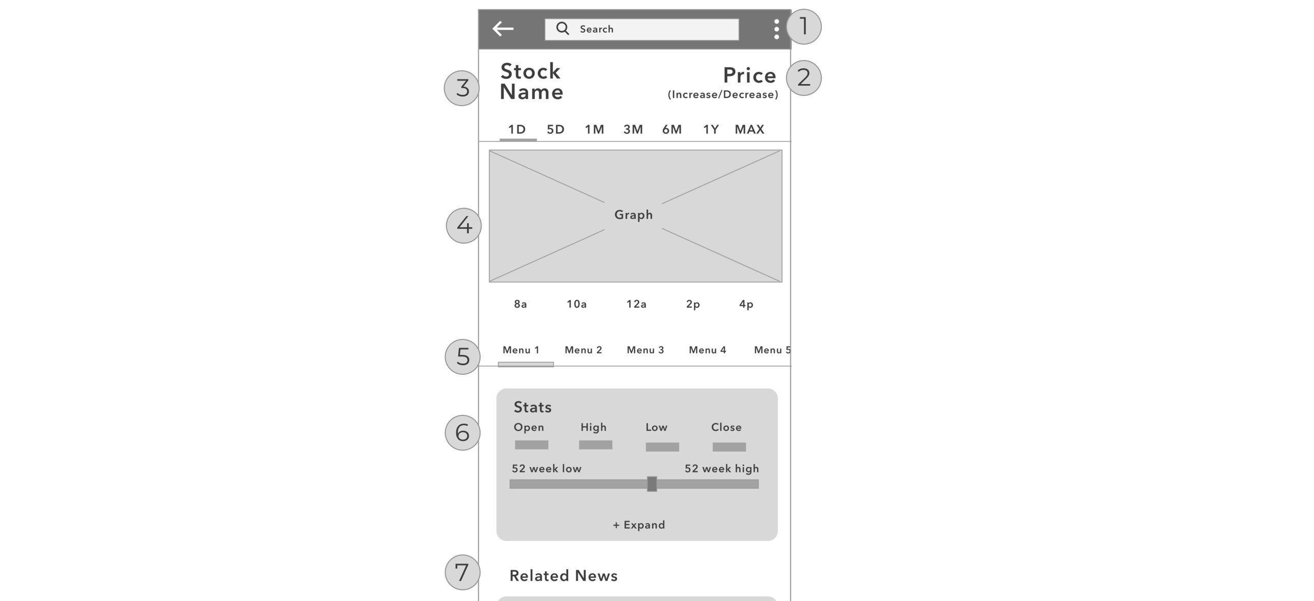
The next step was to begin building wireframes. Annotated wireframes help give more details about each screen.
- Configurable settings option.
- Increase and Decrease should be color coded for easy recognition by user.
- Stock name and price should be the largest font on screen.
- Graph to see stock performance. User can pinch/zoom and swipe for viewing different sections.
- Slider menu for user to see different sections for the stock.
- Stats will update depending upon the date selected in the graph above. More advanced stats can be seen by clicking to expand.
- News specifically related to this stock.